Byeee
Hotel booking app
Case study during UX Design Diploma
About the project
About the project
Problem
Hotel booking apps are becoming increasingly overloaded with content, too much information on one screen, too many options for the user. Many users are confused, don’t find the information they need, don’t trust the app or even cancel the booking in the end.
Solution
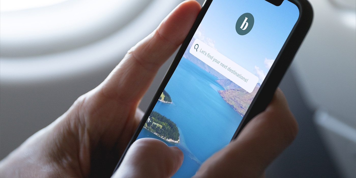
„Byeee“ is a new hotel booking app that focuses on a simple, intuitive way to book the dream hotel the user want. The app supports the user through the booking process and provides the necessary attention to build trust. So that the vacation can start as easy as possible.
Role: UX Research, UX Analyses, Prototype
Company: Case study during UX Diploma
Programms: Figma, Mural, Google Form
Project timeperiod: 2022
Language: English
Workflow
Workflow


01 Research
Competitive benchmark
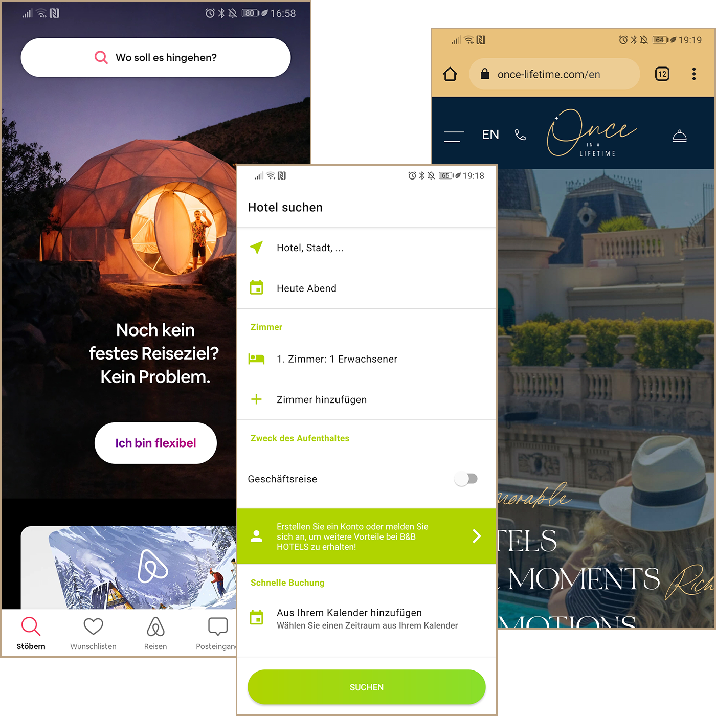
With this method, it was possible to better understand the hotel booking industry, learn what the best apps on the market are doing right and understand the user goals in more detail.
The app and the user should be one. The app should interact with the user and make him/her feel comfortable so that he/she trusts the app. It should trigger the desire to go on vacation by using emotional images.
Everything essential should be at a glance. Important information should be shown on one screen, eliminating the need for scrolling. Buttons or input fields should be reachable with the user’s thumb.
Less is more. The app should have a consistent, structured and reduced style, emphasizing the importance of user input and minimizing distractions.
02 Research
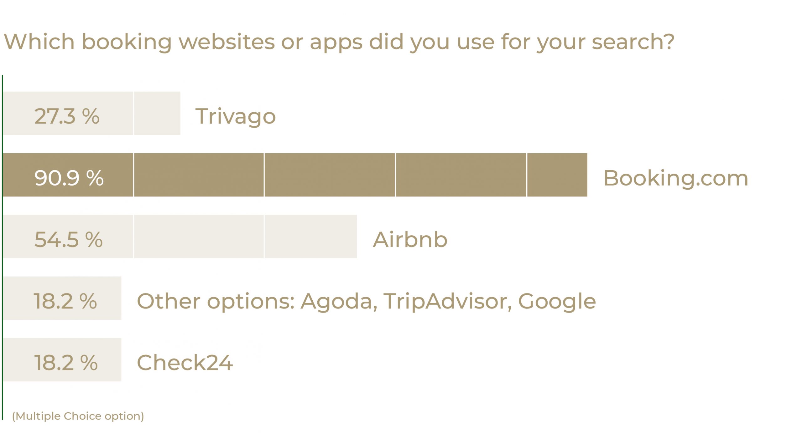
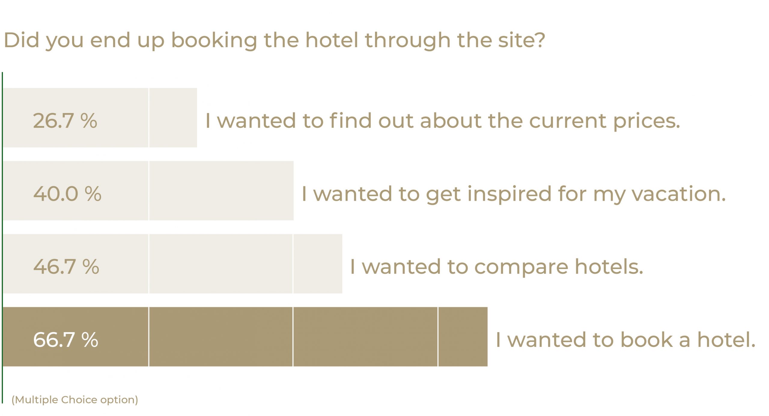
Online survey
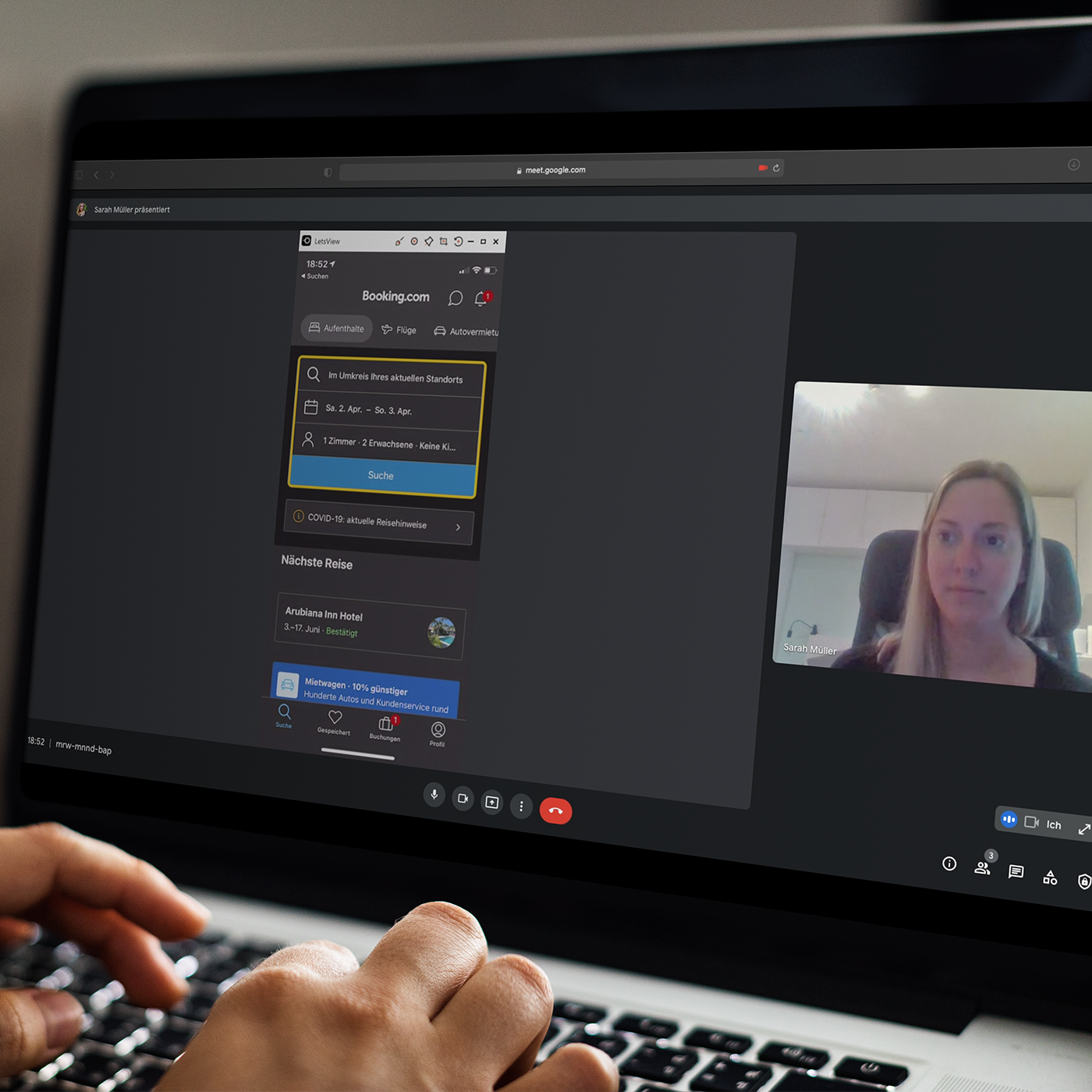
With the data from the online survey, it was possible to identify the wishes of the users and to find out what feedback and functions were used, needed and wanted.
These were the important outcomes?
Simple and easy: The booking process should be simple and quick to work through.
Point out the Benefits of the booking app: There should be features that make it more interesting for the user to book in the booking app itself.
Sort (out) hotels: There should be the possibility to create favourite hotels or to cross out hotels that are no longer in the interest of the user.
03 Research
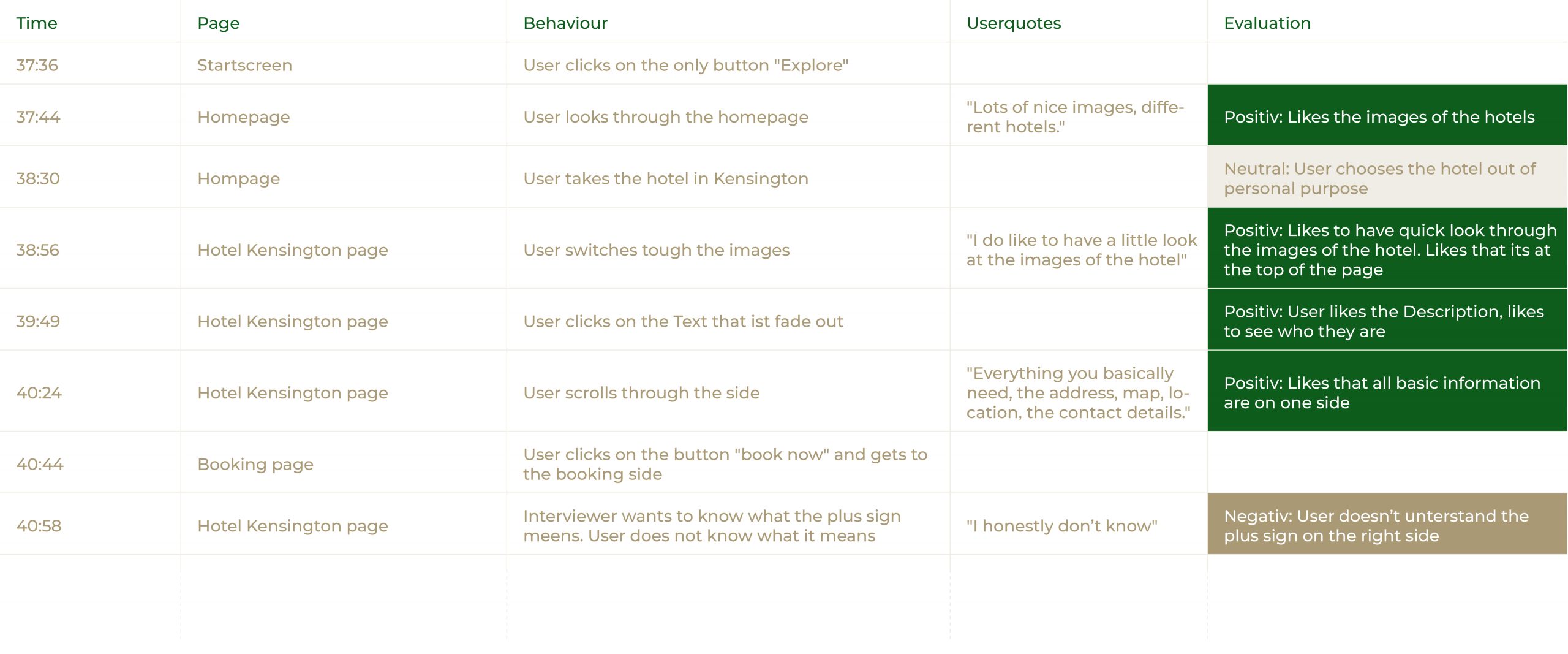
Usability test
While conducting the usability test, it was possible to find out the user’s goals, behaviour, and pain points. I could witness the interaction live and analyze the facial expressions and gestures. This was the result:
Trust is worth its weight in gold. Reviews written by persons are important to gain the trust of the user.
Be as clear as possible. The price display of the searched hotel and other optionally shown hotels should be clearly and obviously communicated.
Different purposes need different options. The option to switch between the map and list view is important for different purposes.
04 Research
Note taking
Watching the videos and taking notes, have brought new insights into how users really react to the apps and what pain points they come across. It was possible to analyse the different emotions, reactions and facial expressions in comparison to what they said out loud. This was the result:
Touch the user’s emotions. Short videos of locations should be shown to trigger the desire to go on a vacation.
Don’t overload the user. A sensible balance of the amount of information given to the user should be found.
Don’t over-explain things. Icons and buttons should be self-explanatory.
05 Analysis
Affinity diagram
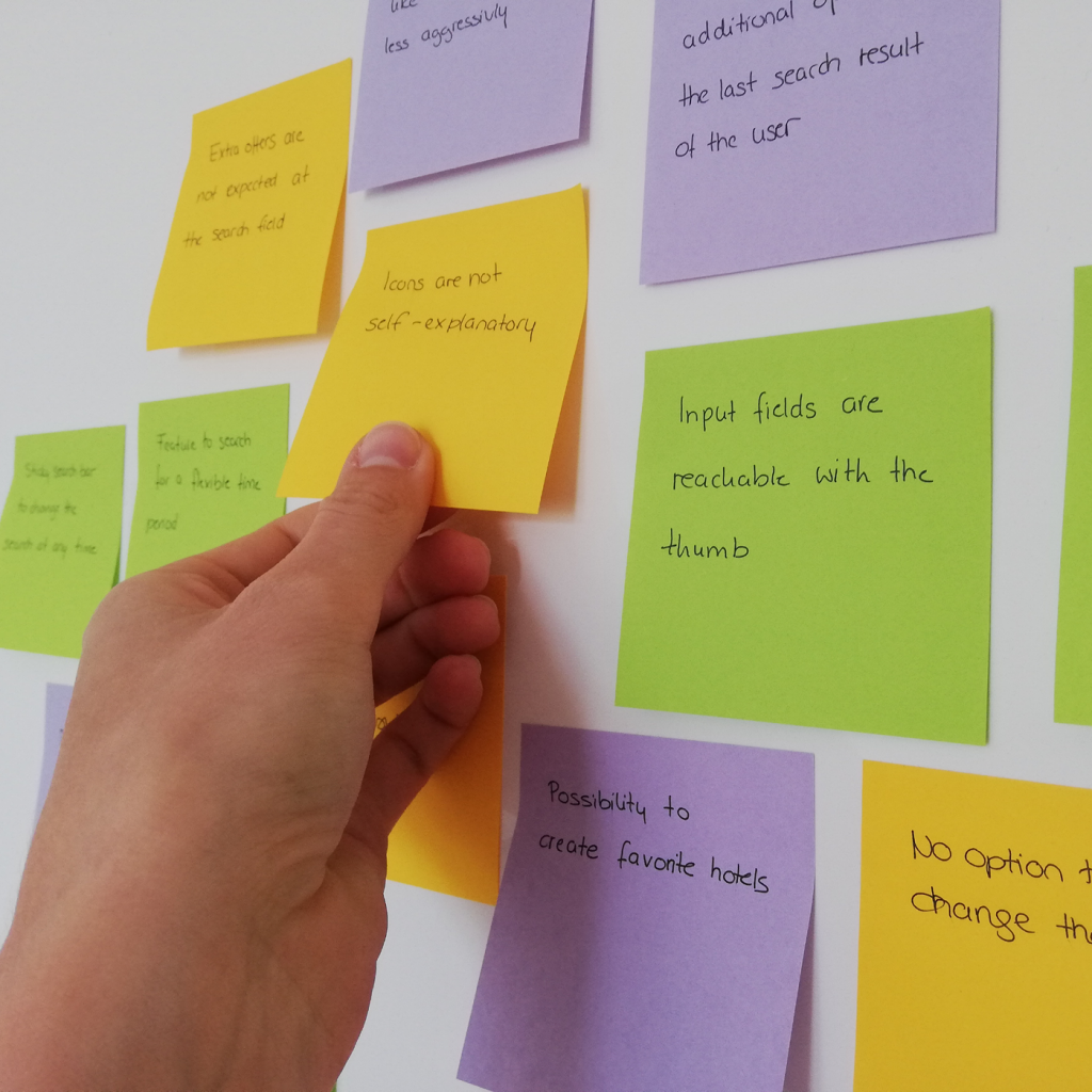
The research data could be divided and sorted into groups and subgroups. These groups made it possible to understand the pain points in relation to the different steps of the flow and to delete all unimportant and duplicate data. This was the result:
Focus on the important sites. The home screen and result page are used most often.
Make it easy. The flow from the home page to the result page using the search and filter should be easy and smooth for the user.
Simple design. The design should be simple and supportive and focus on communicating information.
06 Analysis
Customer journey map
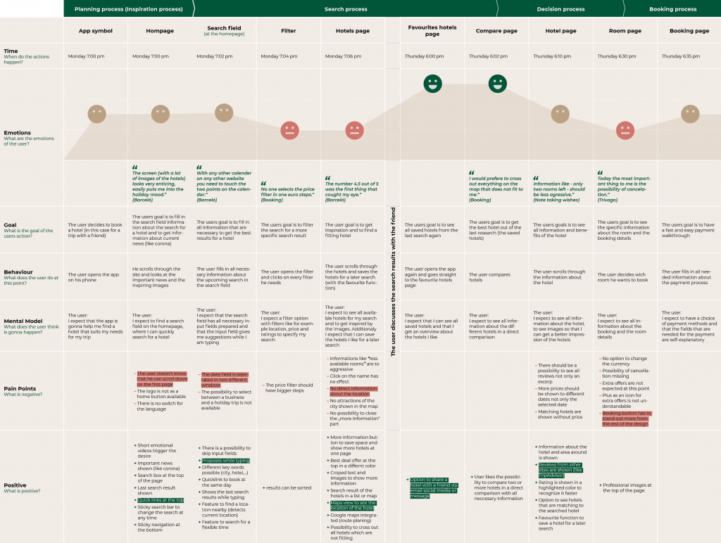
Based on the analysis of timestamps, user goals, behaviours, mental models, pain points, and positive points, several noteworthy pain points emerged during the user’s journey. The following areas were identified as particularly challenging for the user:
The most difficult experience for the user during the flow was the filter options, the hotel page and the room page. Most of the pain points happen during this state of flow. Also, the search field and booking page happened to be difficult for the user.
Goals

Trust
Gain trust in the app and create emotions that build a connection with the app.
Reduction
Design easy, simple and clear. Don’t overload with information. Be self-explanatory and focused on the important things.

Overviews
Give an overview of everything, so the user feels informed and sure about the booking app at every step of the flow.
07 Ideation
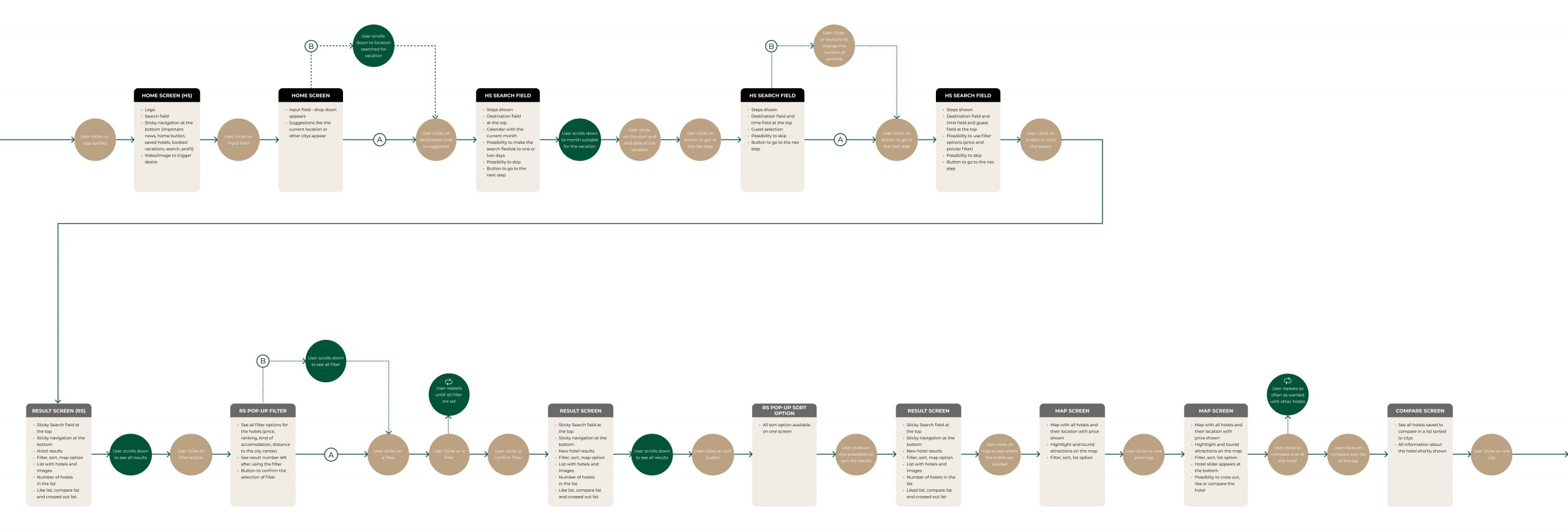
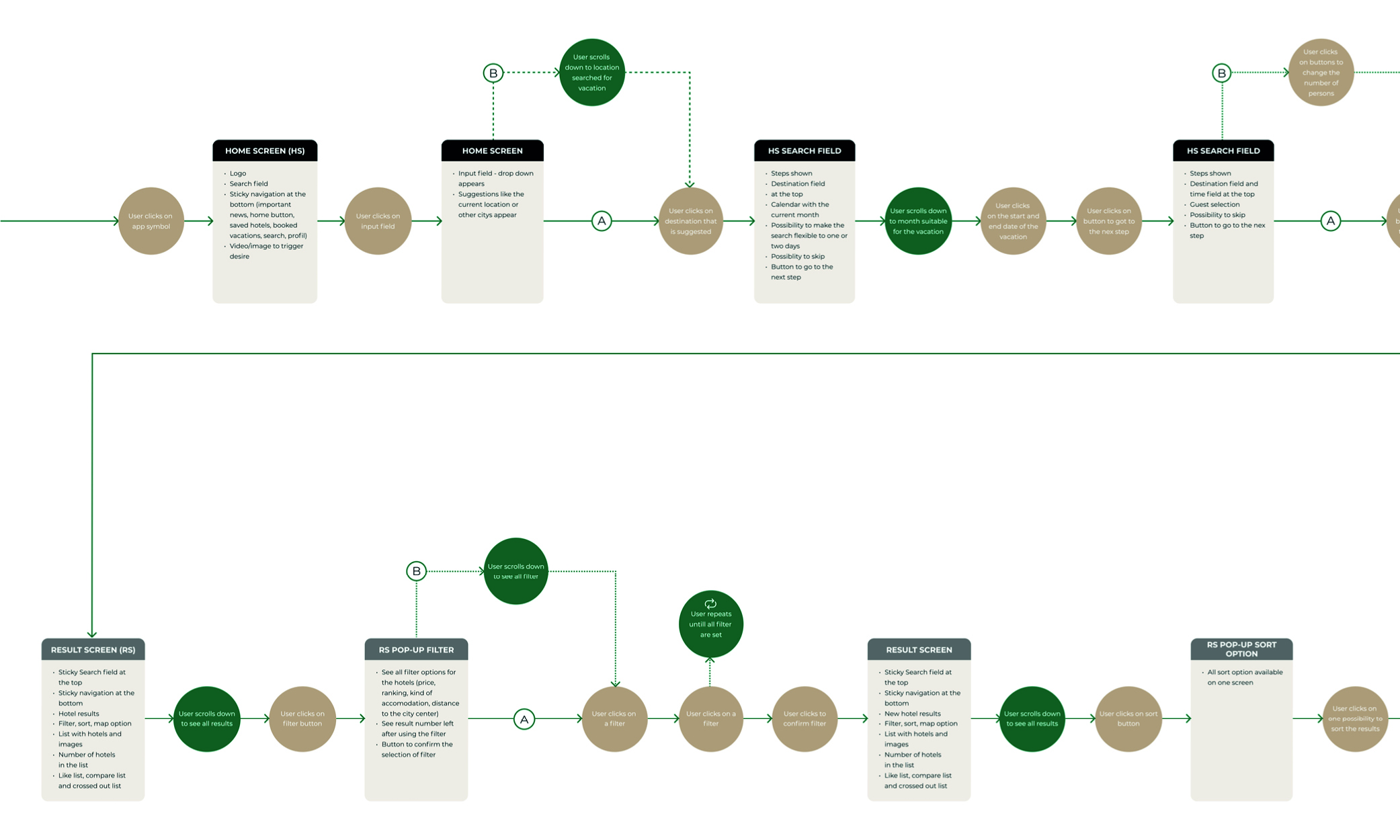
Flow diagram
The sketched flow diagram gained insights to understand the full flow in detail and to capture visually what information, features and functions needed to be presented on which screen. The flow is separated into five sections. During these different sections, the user has to make a different decision, that leads to different flow options. The flow is cut into two, based on the research results that users often take a break during their research and the actual booking.
08 Ideation
Interaction design
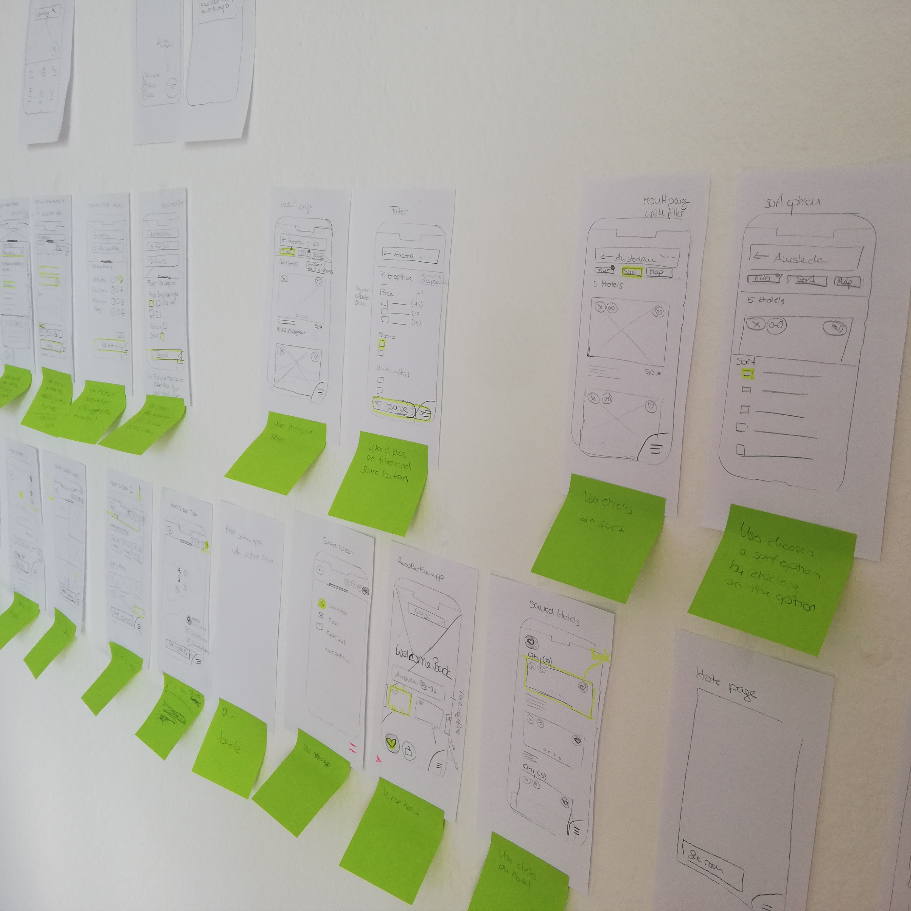
I used hand sketches to layout the different screens of the flow. I used the flow diagram as a template, so that I could easily create one screen after the other. During this process, the important thing was to stay focused on the rough wireframes and not to get lost in the details. During the creation process, I encountered obstacles that I was able to remove, by working with easily editable hand sketches.
09 Prototype
Medium fidelity prototype
With Figma, I was able to build a clickable medium-fidelity prototype and to focus on the features, the flow and the achievements of the user’s goal. During the process, I could expand and improve the flow. I tested the medium-fidelity prototype with users and worked out the not-functioning screens and flow elements. I learned that the flow was too long, so that the user was irritated and couldn`t follow the flow at all time. So I divided it into four small flows, to better evaluate the functions.
10 Prototype
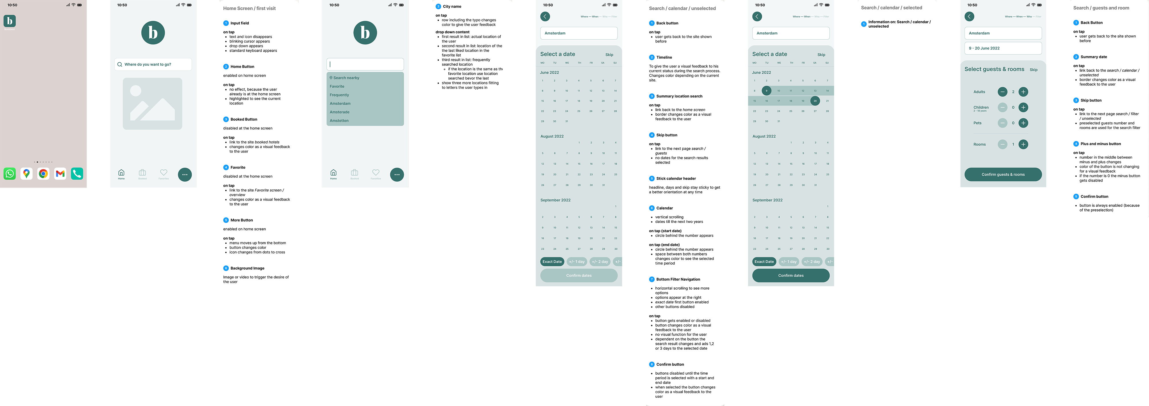
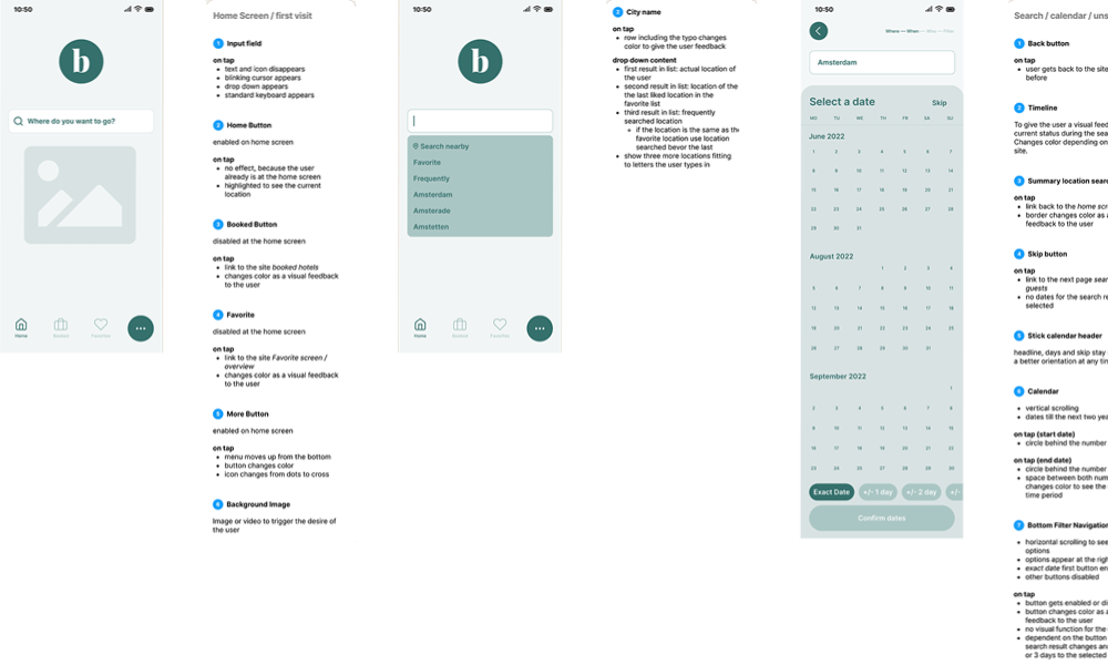
Annotations to the developer
The annotations help the developer understand the different structure, layout, content and functionality of the different elements, so that they easaly can develope them. Because the annotations were made in the prototype cheat, the development team can use the prototype to get a better feeling for each step. The annotations were cut to the primary information providing enough information to know the function and effect of the respective element and not to overload the developer with unnecessary information.
Final thoughts
What I have learned
I have learned that I should get rid faster of designs that don’t work. 🗑 That it is important to appreciate feedback and that I should do as much user tests as possible to exclude errors. During the project, I also learned that qualitative research is the fundament of a whole UX project. And that the research has to be close to the target audience, to fully understand their goals, behaviours and the context of the project. 🤓
For the next project
For this project with the closing of the UXDI Diploma, it was important to work on the project on your own. For the next project, I am thrilled to work in a team with real exchange and teamwork.💬

