Hinzling
Corporate Branding
Freelance work for Freshling UG
About the branding
About the branding
About Hinzling
Sustainability, conscious shopping and reusability are all topics that are becoming more and more important. There are many areas where you can reduce your own waste. For example, in the area of disposable diapers. Tons of diapers are thrown away every day and they are difficult if not impossible to break down. Freshling UG has created Hinzling, a brand that produces sustainable cloth diapers and diapering products, to avoid unnecessary waste. The diapers are not only in a modern design but also easy to use.
About the project
In this project, I had the opportunity to establish a brand from scratch and developed the brand design. All parts of the brand were newly emerged, from the corporate branding to the pattern design.
Role: Corporate Branding, Corporate Design
Company: Freshling UG
Programms: Adobe, Klaviyo, Procreate
Project timeperiod: 2020 – present
Language: German
Workflow
Workflow


01 Brand research
Interview
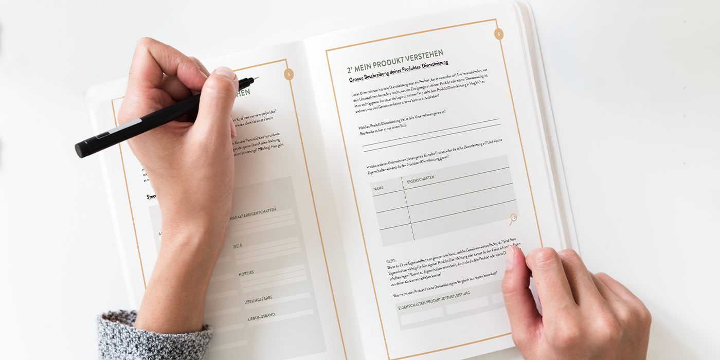
The goals and brand management could be fully understood and analyzed during the intensive interview with the management. The result of the interview laid the foundation for further developing the brand’s corporate design. It quickly became clear that the company’s goals were evident but the exact mission and vision were not defined at this point. In the next step, the management worked with a self-developed worksheet to get a deeper analysis of the brand.
02 Brand research
Worksheet
The management successfully defined the goals, mission and vision using my self-developed worksheet. Based on this, we were able to define the corporate identity. Based on this the corporate design could be developed in the next step.
Mission: Made in Europe, our modern cloth diapers allow every child to enjoy natural diapering time and are a sustainable alternative to disposable diapers.
Vision: Delighting one more family every day with our cloth diapers.
03 Design research
Competitors
With the analysis of the competitors, it was possible to better understand the cloth diaper industry, identify what the best companies on the market are doing right and understand the customer’s needs. These were the results:
Fresh parents are searching for sustainable diapers with timely and modern designs.
Easy and quick usage of diapers is a prerequisite for customers, this is why it is so important to educate the users about cloth diapers and to eliminate prejudices.
04 Design research
Mood board and Matrix
With the mood board and matrix, I was able to develop an overall design picture together with the management. The interaction between the different design elements could easily be discussed and proved. For that, the matrix pointed out the five most important categories for the brand.
Associations: Basic associations were developed to use for the logo.
Colours: The colours should be neutral, natural and restrained.
Icons: The icons should be reduced to the essential information, but become as detailed as necessary.
Font: The font should be natural and modern but not too childish and playful.
Shape language: The naturally formed shapes should make the customer feel cosy.


05 Logo ideation
Logo idea
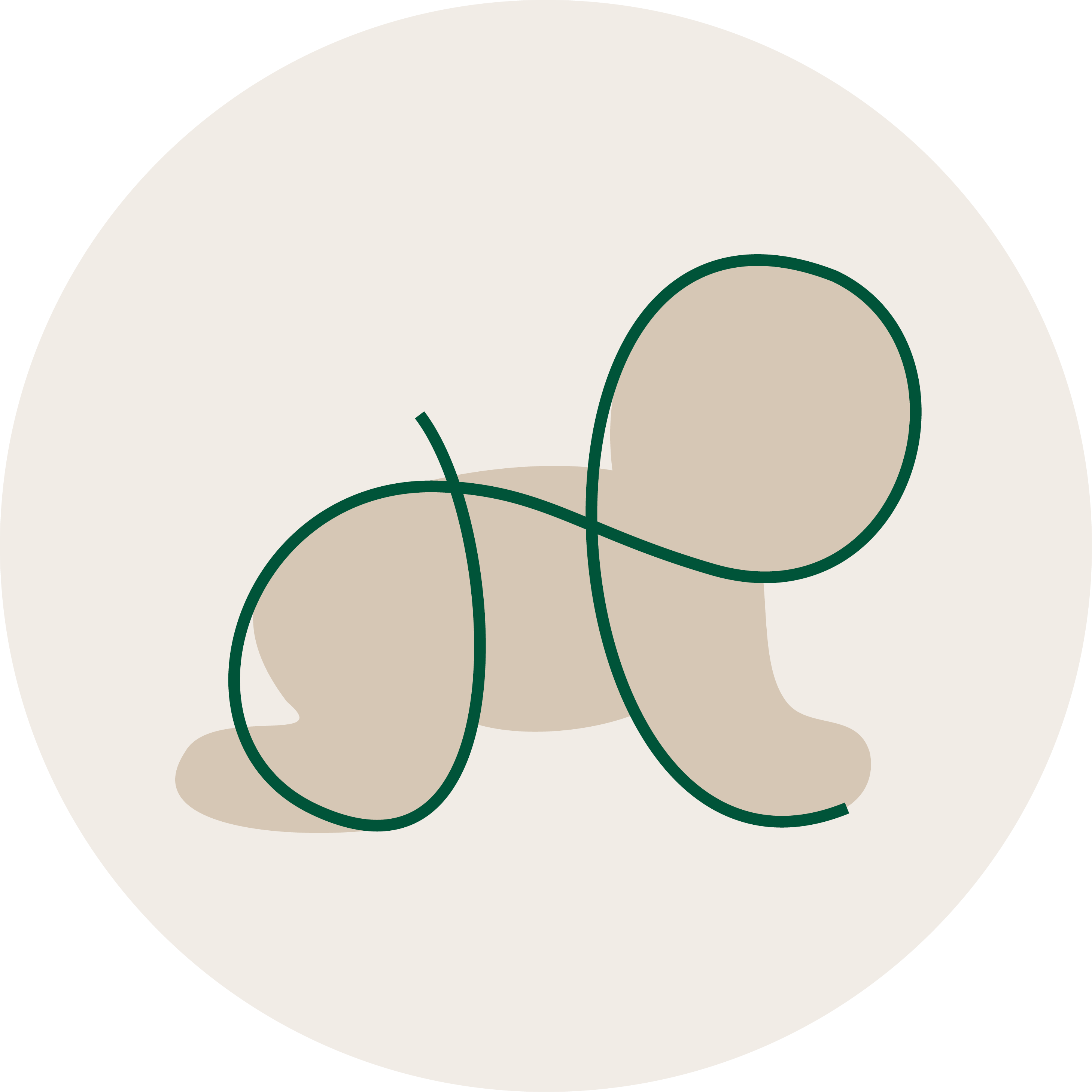
The two most important facts to show in the logo were the H for Hinzling and the form of a child. Because of the abstract and drawing form of the child (with the diaper butt), this could be combined with the handwritten H of Hinzling to form one sign. This is how the very personal and individual sign for the brand. The logo colour blue was chosen to communicate the user trust and cleanliness.
06 Logo ideation
Logo implementation
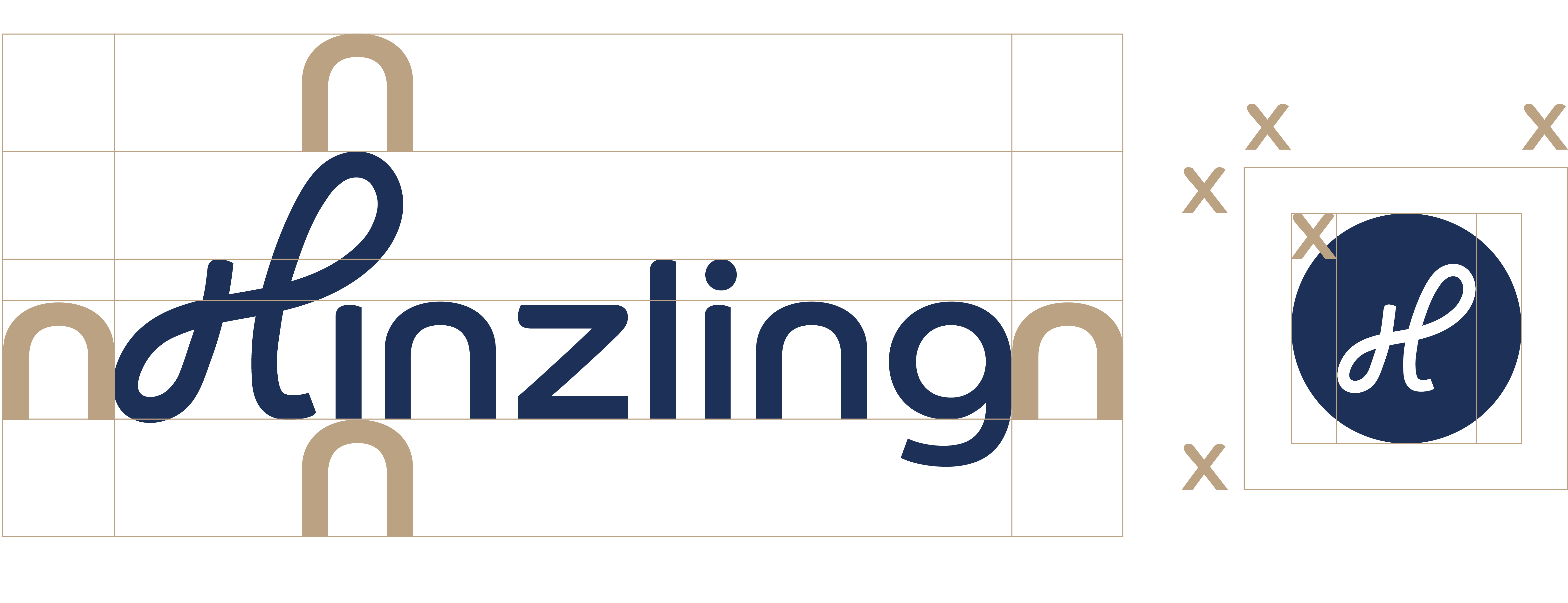
The other letters of the logo were built with the font Co Headline. The round stroke terminals bring a natural and personal note to the logo without making it too childlike. As the typo designer himself describes: „The stroke terminals take their inspiration from the curve of leaves on a tree, and make the family friendly and welcoming.“ daltonmaag.com
07 Design ideation
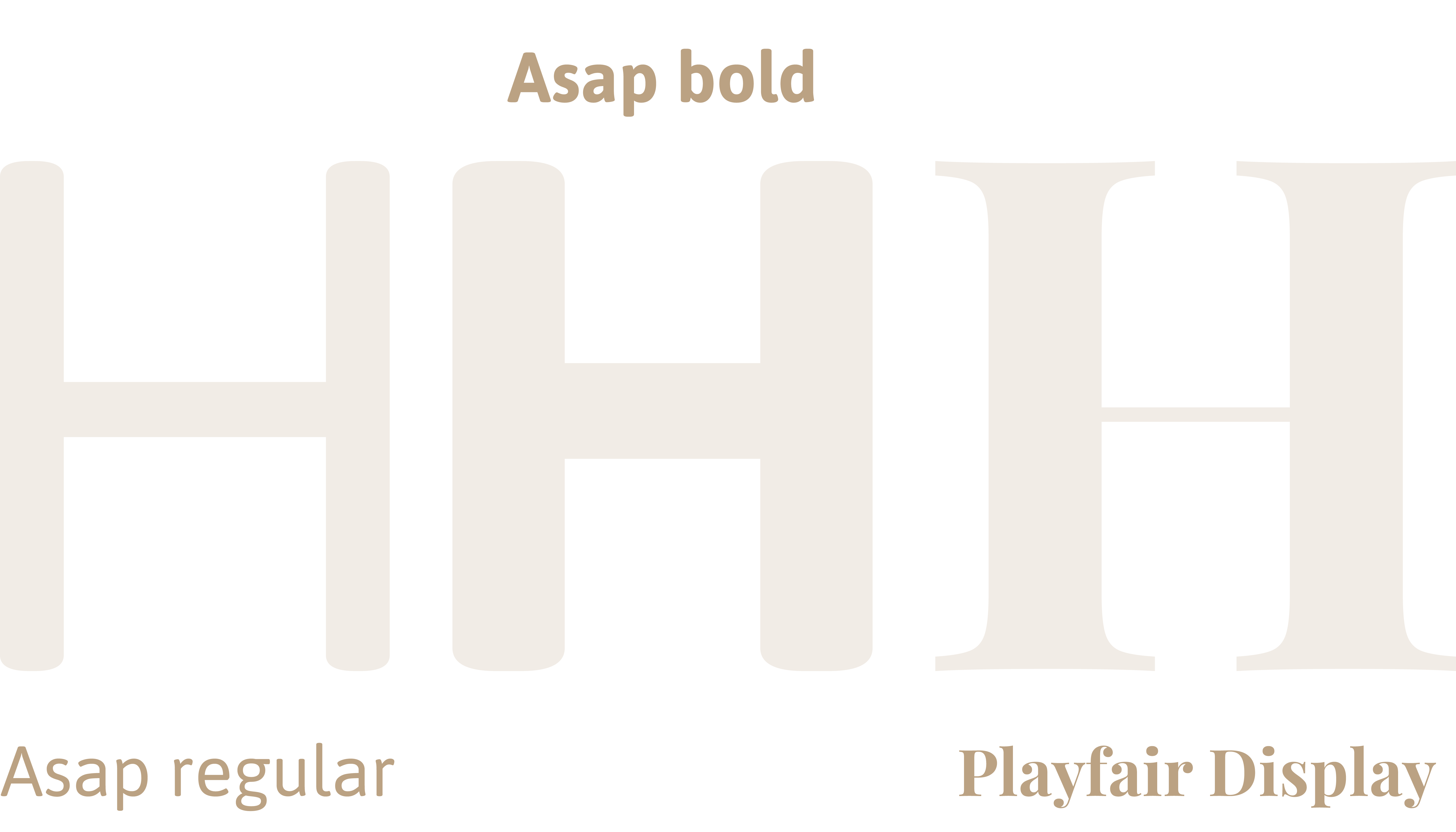
Brand typo
The corporate fonts are a mixture of the Asap and Playfair Display typefaces. The Asap font was chosen for its round stroke ending and clean appearance. To contrast with this font, Playfair Display was chosen for awards and headlines. Playfair is intended to give the corporate design a modern, factual character.


08 Design ideation
Brand colour
The colours for the brand Hinzling are chosen for their natural and calm appearance. Because of this appearance, they do not contrast with the colourful pattern designs. The different colours are chosen for:
Blue: clarity, trust, purity, responsibility
Beige: diaper, skin
White: cleanliness
Green: sustainability, reusability
Gold: family
09 Design ideation
Icons
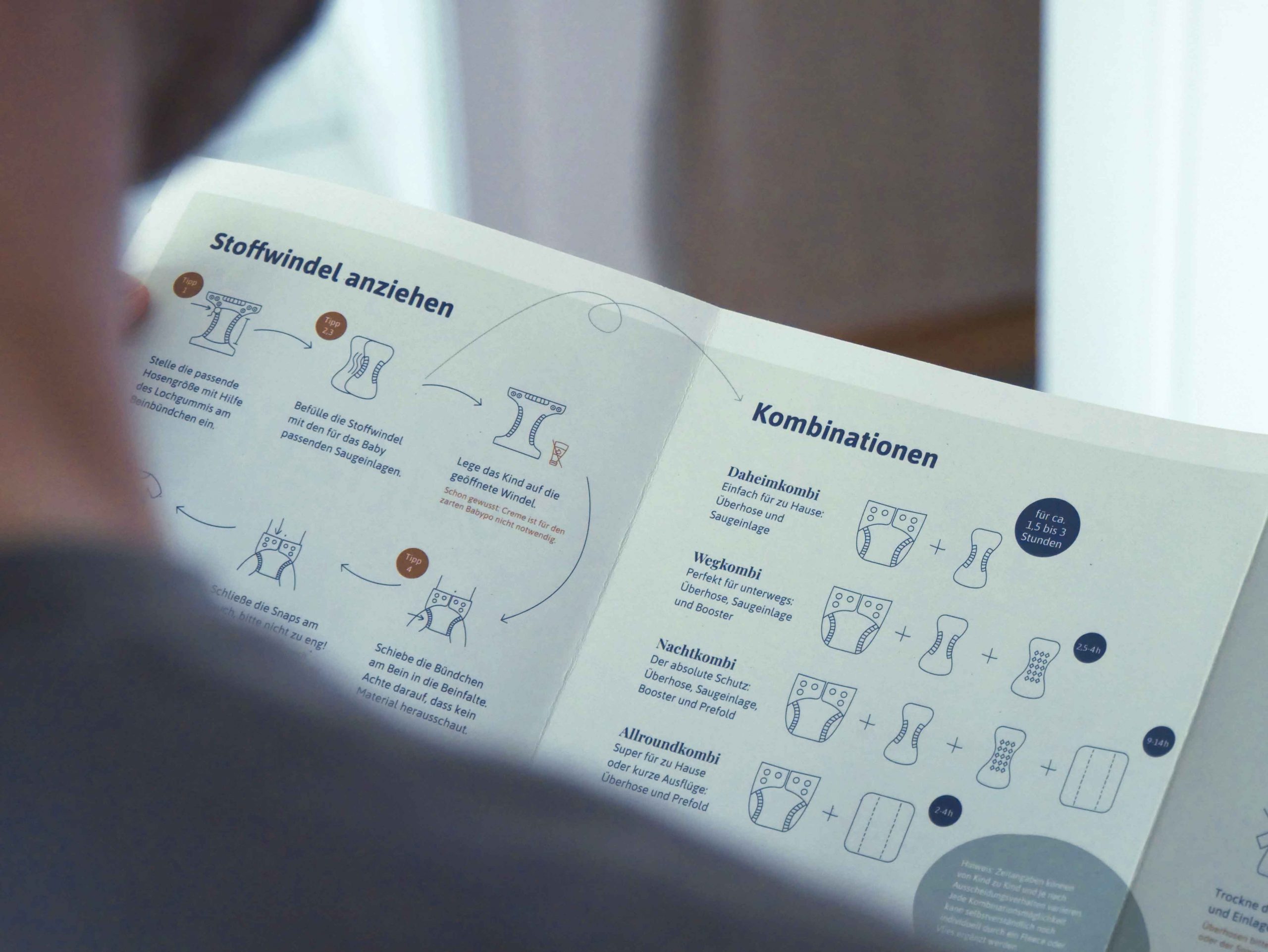
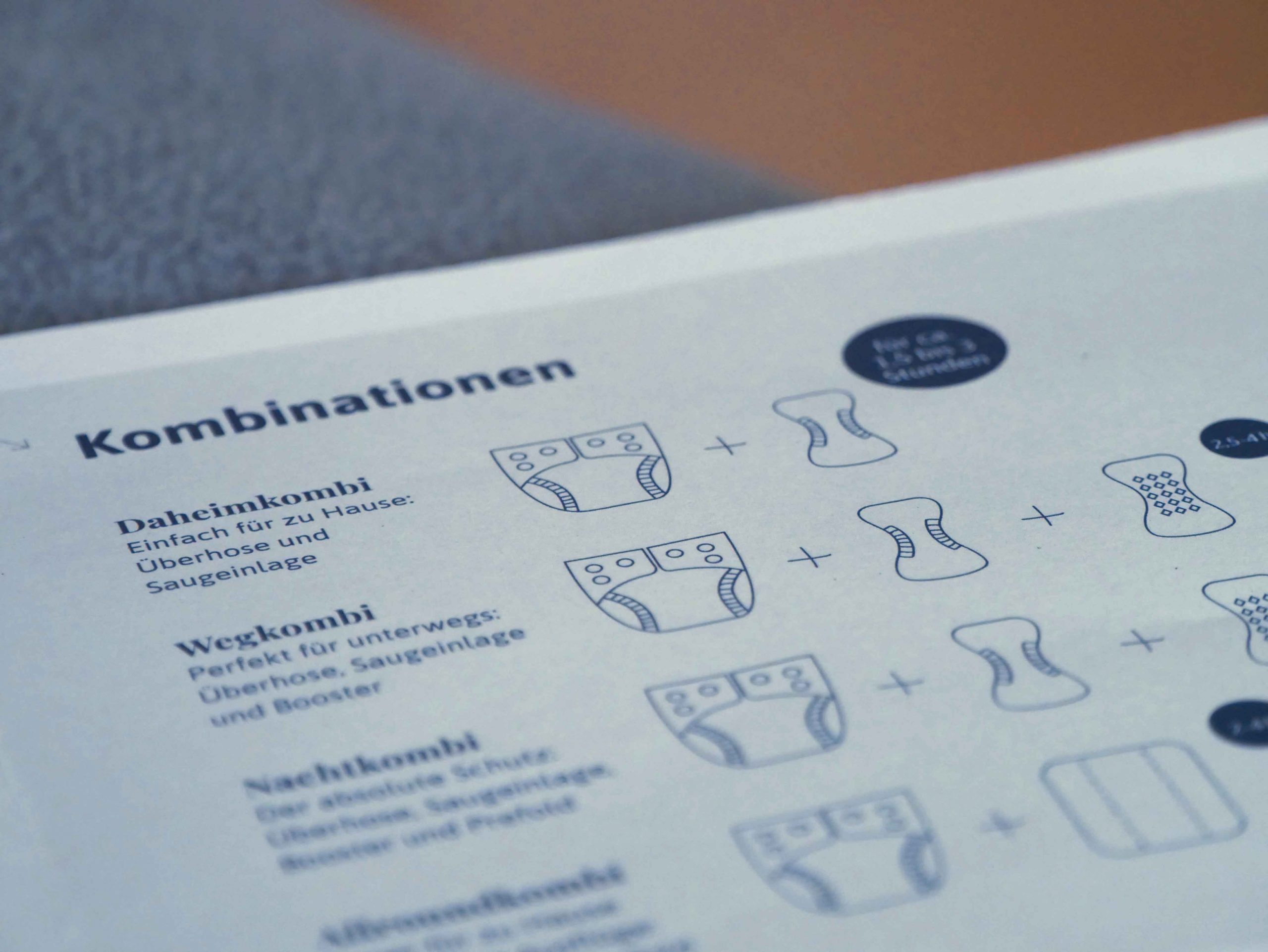
The icons are important to communicate all important information at a glance, but not to overload the user. For that, the icon style was used very clean and minimalistic. Because of the linear style, the icons stand back from the product images.
10 Design ideation
Patterns
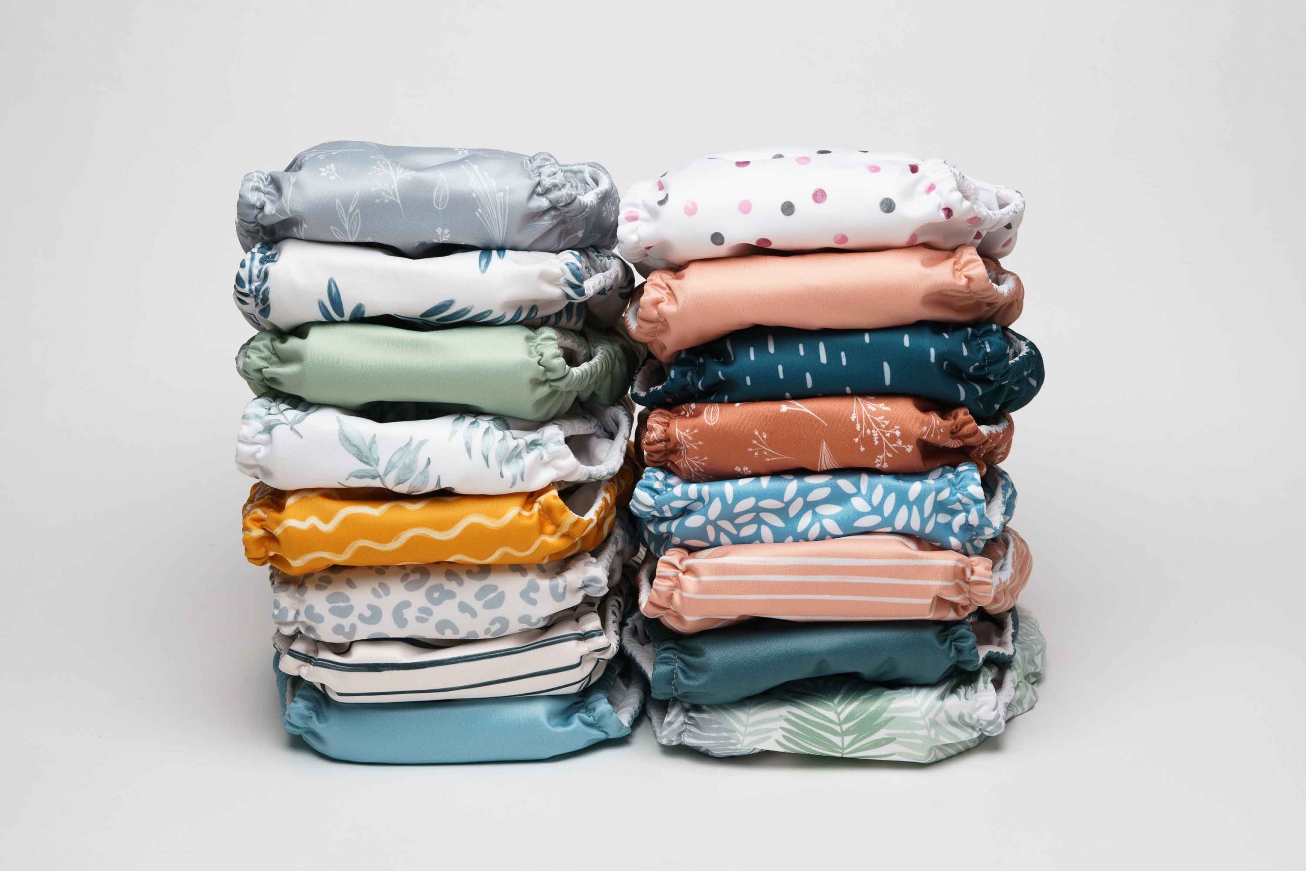
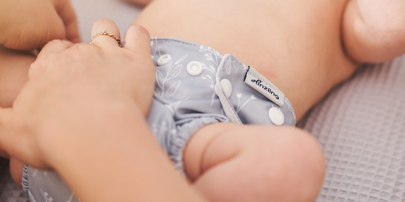
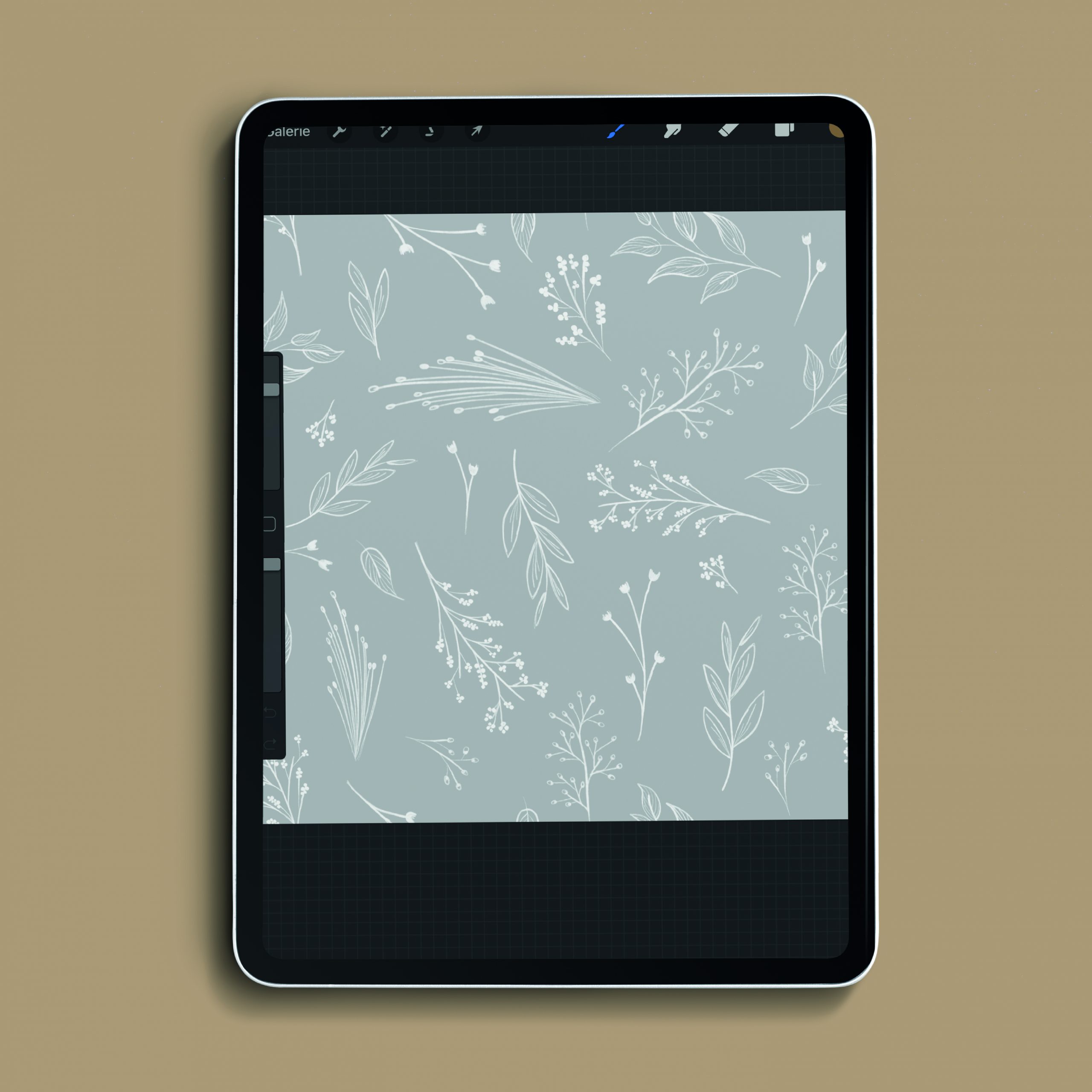
The pattern design is based on research data for trends, customer needs and current pattern designs for cloth diapers. Based on that, the management of Hinzling and I created a bundle of different designs, mixed between simple clean forms, reduced drawings and colourful paintings.
Implementation

Print medien
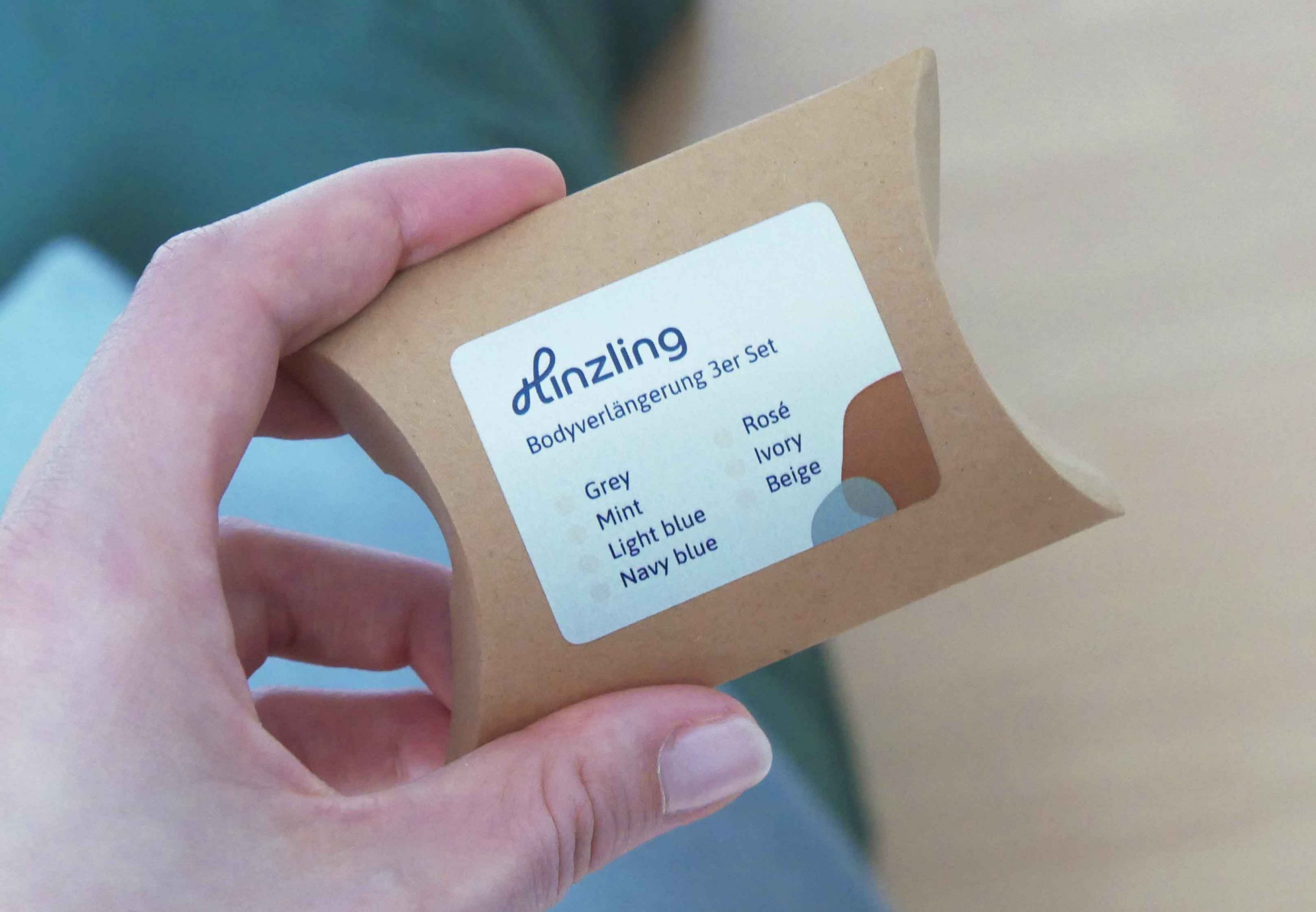
Flyers, banderoles, coupons, packaging, exhibitors, …

digital
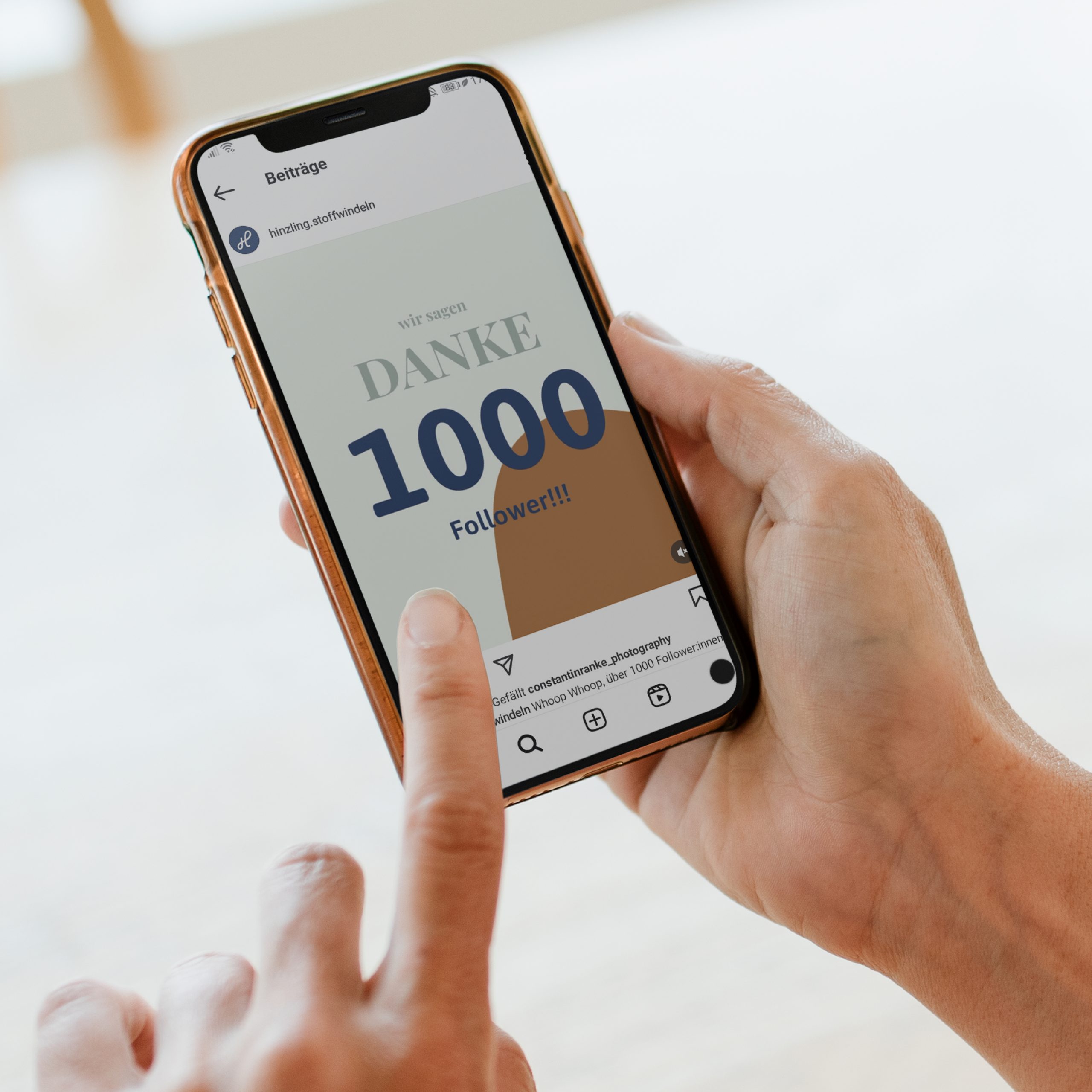
Social Media Posts, Website Elements, …

pattern design
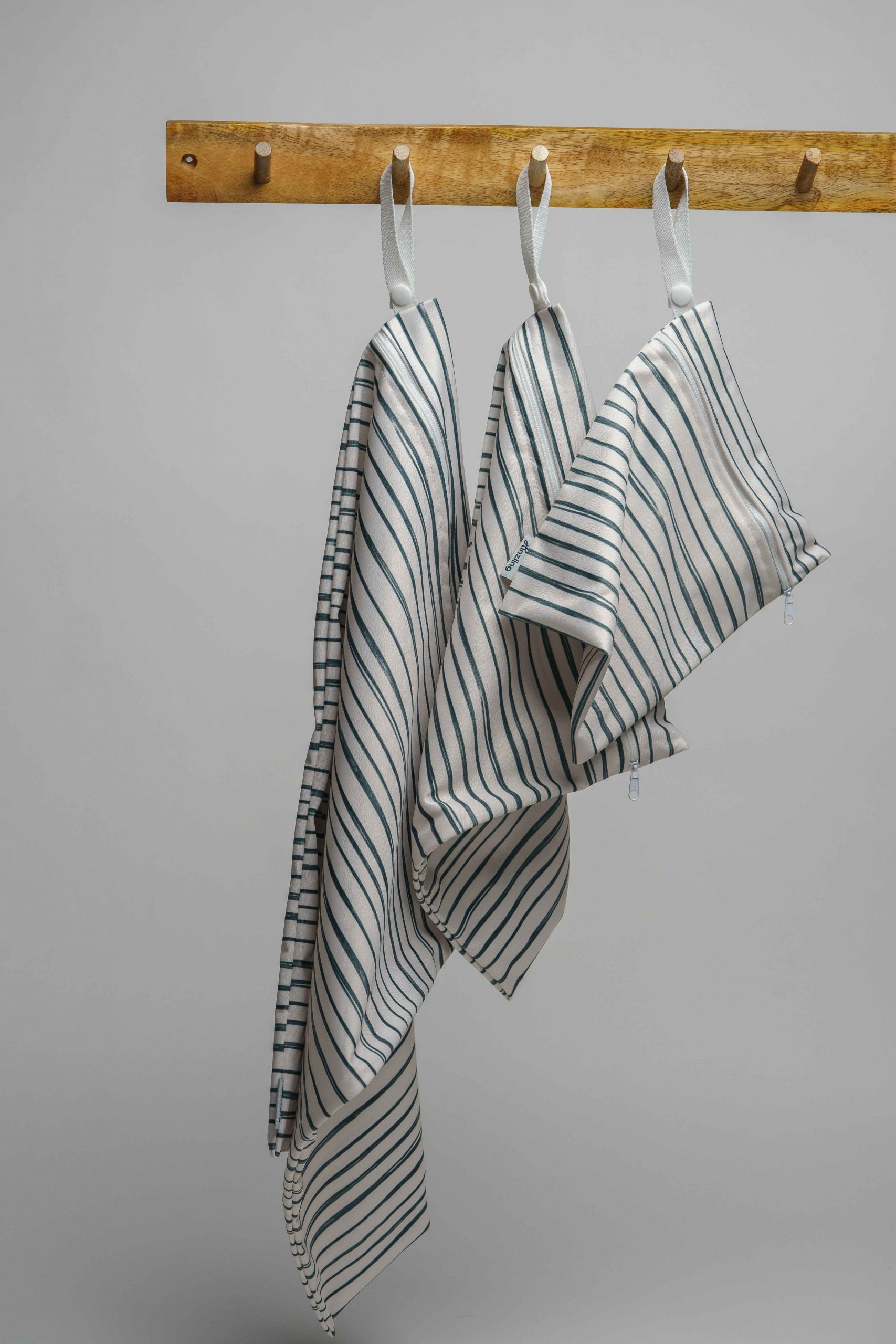
Cloth diapers, swim diapers, absorbent pads, wetbags, …
Implementation examples
Final thoughts
What I have learned
The creation of a brand is based on a lot of research and conception. Until the vision and mission are completely clear there are a lot of steps to climb.🗻 Only based on a complete and logical identity the corporate design can be developed. I learned that you need to be patient at the beginning and put some more energy into the analysis before starting the actual design part.🔎.
For the next project
I loved collaborating closely with the management as it allowed me to actively contribute to defining the brand identity.🤝 This experience helped me understand the brand so that I could base on this understanding while developing the corporate design. I hope that I have a similar opportunity with the next project.

